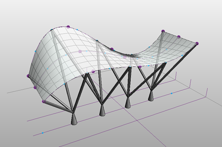
A place to keep all things revit ....and some other stuff too!
This site is not sponsored or endorsed by, or affiliated with, Autodesk, Inc.
Monday, December 31, 2012
Happy New Year
Just wanted to say HAPPY NEW YEAR and let's make 2013 even better!
thanks for all the visits!
Wednesday, November 28, 2012
AU 2012 Virtual Video on Stairs & Rails
Nice work by Robert Manna from AU2012's Virtual Class:
"Stairs and Rails in Autodesk® Revit® 2013: A Practical Primer"
The additional materials is available HERE
The handout is available HERE
Module 1: Introduction to Component Stairs
Module 2: Creating Stairs From Scratch
Module 3: Fine Tuning a Stair
Module 4: Intro to Railing Improvements
Module 5: Fine Tuning the Handrail
Module 6: Editing Transitions
Module 7: Working with Handrail Supports
"Stairs and Rails in Autodesk® Revit® 2013: A Practical Primer"
Description
This class will introduce Autodesk Revit
software users to the new "stair by component" tool included in Revit
2013. We will review the basic components, how the stairs are assembled,
how to edit and modify the stairs, and how to create a new stair. We
will also examine some stair conditions that can be more easily
addressed with the new tool. We will also will take a close look at some
of the key railing enhancements in 2013 and how to use and apply them.
Key Learning Objectives
- Describe the stair components
- Model a stair that overlaps itself
- Modify a stair and create more complex conditions
- Apply the new railing enhancements to greatly improve your railings
The additional materials is available HERE
The handout is available HERE
Module 1: Introduction to Component Stairs
Module 2: Creating Stairs From Scratch
Module 3: Fine Tuning a Stair
Module 4: Intro to Railing Improvements
Module 5: Fine Tuning the Handrail
Module 6: Editing Transitions
Module 7: Working with Handrail Supports
Monday, October 22, 2012
interesting bit about stacked walls_Thanks Revit Geek!
Thanks Brian Mackey (The Revit Geek)
NOTE: see the Revit 2013 note at bottom
Stacked Walls and Design Options
Great post by Brian Mackey (The Revit Geek)
A client was having an issue working with design
options and stacked walls the other day. When the stacked wall was
selected it wouldn’t allow it to become part of a design option. I
started an new file and had the same issue as he was having, however
when I went to do it again for this post the issue didn’t happen again,
then I realized it had been changed in Revit 2013. I thought I should
post it anyway in case this issue does happen for others still using
2012.
As with any element if the host is going to be apart of the design option then anything hosted to it must be part of that same option. For instance all doors and windows hosted in a wall must be part of the same design option the wall is in. Stacked walls are the same, each wall type that make up the stacked wall are hosted to the stacked wall (at least we will say that for this situation), so the stacked wall and all of the individual wall types that make up the stack must be selected in order to become part of a design option. For this to happen the “Tab” key will need to be used to select the individual wall types.

As with any element if the host is going to be apart of the design option then anything hosted to it must be part of that same option. For instance all doors and windows hosted in a wall must be part of the same design option the wall is in. Stacked walls are the same, each wall type that make up the stacked wall are hosted to the stacked wall (at least we will say that for this situation), so the stacked wall and all of the individual wall types that make up the stack must be selected in order to become part of a design option. For this to happen the “Tab” key will need to be used to select the individual wall types.
**In Revit 2013 they improved on the entire selection process for adding elements to design options. Most notably if you select a host element now everything associated with that element will become part of the design option. No longer do we have to select all the doors, windows, etc they just go. HUGE improvement for working with design options in my opinion.
Wednesday, October 17, 2012
Revit 2013 - update 2!
From Luke over at What Revit Wants
(nice find - thanks Luke!)
Wednesday, October 17, 2012
Revit 2013 Update 2 download links
Revit Architecture 2013 Update 2
http://updatesdl.autodesk.com/updates/files/rac2013ur2.exe
Revit Structure 2013 Update 2
http://updatesdl.autodesk.com/updates/files/rst2013ur2.exe
Revit MEP 2013 Update 2
http://updatesdl.autodesk.com/updates/files/rme2013ur2.exe
Revit OneBox / RVT (for Suites) Update 2
http://updatesdl.autodesk.com/updates/files/rvt2013ur2.exe
For Revit OneBox (Building Design Suite version), the link should also eventually appear at:
http://usa.autodesk.com/adsk/servlet/ps/dl/index?siteID=123112&id=2334435&linkID=16831210#section21
when it is available (I will also update this post when there is an official suite version Update 2 link)
thanks
Tuesday, October 16, 2012
CADclip's REVIT 2013 Video on Graphic Design Options
Thanks CADclip for this vid on Graphic Design Options - good place to see all the variations within Graphic Display Options
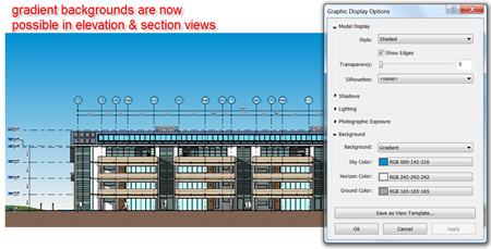
These new options which include Background Images, Photographic Exposure, Transparency and much more are all available in various views such Sections, Elevations, Perspective and isometric 3D views for Hidden Line, Shaded, Consistent Colors and Realistic visual styles. You can also save these settings to a View Template to apply it to other views. These are all features used to enhance the visual effect of the views but do not require 'Rendering'.
These new options which include Background Images, Photographic Exposure, Transparency and much more are all available in various views such Sections, Elevations, Perspective and isometric 3D views for Hidden Line, Shaded, Consistent Colors and Realistic visual styles. You can also save these settings to a View Template to apply it to other views. These are all features used to enhance the visual effect of the views but do not require 'Rendering'.
Friday, September 21, 2012
Arch | Tech: Zoom To Awesome!
Testing is complete. This add-in kicks an infinity of ass. If Chuck Norris used Revit - this would be his favorite tool. Caution: you may smack your forehead with your open palm after using this amazing tool just one time. You will wonder why you didn't think of this. You will wonder why no one at the Revit factory has thought of this.
You will demand this functionality be included with Revit.
Don't say we didn't warn you.
- End User License Agreement (EULA) -
By installing the "Zoom To Awesome" Revit Add-in, you agree to be bound by the following Terms of Service (TOS):
1. You agree to follow Don Bokmiller (@dbokmiller), Elier Ramirez (@TBD - Sheesh!) and yours truly (@philread) on Twitter.
2. You agree to provide at least one of us with an adult beverage during AU2013.
3. You agree to Twitter/email/Facebook/crosspost/etc the download link to your fellow Reviteers in order to give them a sense of childlike joy and wonder (#ZoomToAwesome).
4. You agree not to pester us if you install this add-in and something goes horribly, inexplicably wrong (even though Don and Elier assure me this is completely unlikely to happen).
Okay, ready? Hyperventilating? Tunnel vision? Here we go!
Steps to success:
1. Download, unzip and install "Zoom To Awesome":
2. Open your favorite Revit project and look around - like the floor plan in this sample project. There sure is a lot of stuff. Hey - there's a tiny toilet in the distance. Pick the object:
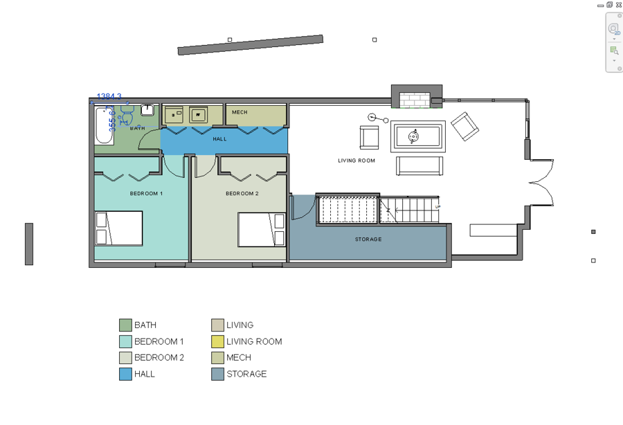
3. Go to the Add-Ins panel, select External Tools and Select "Zoom To Awesome":

4. You will be immediately transported to the selected object(s) that remain selected for your convenience:

But wait - there's more!
- Works in 2D and 3D!
- Works on geometry, tags, text, detail components and more!
- You can even map a keyboard shortcut ("ZX" rocks!)
Why waste your time innaccurately zooming in and out with a scroll wheel?
Why use the Zoom In Region tool in order to select something when you can zoom to it by selecting!
Happy Friday!
Very cool! Thanks Arch | Tech !
Note: I found that adding a quick key (type "ks" to add) really helped get this into action FAST! (I used "zq")
Enjoy
Note: I found that adding a quick key (type "ks" to add) really helped get this into action FAST! (I used "zq")
Enjoy
Monday, September 17, 2012
2013 "What's new" re-post for office use
original post by David Light over at Revit blog
What's new in Autodesk Revit 2013?

The year is 2012 & the Autodesk fanfare announces the arrival of Revit 2013. The Revit technology has now been under Autodesk ownership for just over 10 years. Wow! How the world has changed in that time, politically & economically. 10 years ago I would have never believed that Revit would have had such an impact on my career. Back then the original Revit vision was a one stop shop solution for all AEC disciplines. Whilst the tools for structure were less developed than those for architecture, certainly I was aware of engineers who were using Revit. I once heard a blasphemous rumour that a MEP tool set was being developed for Revit, but to this day, can’t confirm or deny that was the case. Either way, Revit was seen as a holistic solution that would serve the AEC industry. Nether the less Autodesk saw things differently & divided the product up into the 3 flavours that we know as Architecture, Structure & MEP. But Autodesk have been under pressure from the industry to look at the way Revit is served up. BIM by its nature is a collaborative effort & many multi dis firms are using all flavours of the product. Also, other firms want to use architectural tools in say an MEP workflow. The industry has spoken, there should be no BIM silos, so Mr Autodesk, give us the Revit product which includes all the disciplines!
Revit 2013 will come in its now well established traditional flavours of Architecture, Structure & MEP. But it will also come as a complete AEC solution, code named “OneBox” during development, this will be all three disciplines installed as one. The official name will just be Revit 2013. In Revit 2013 you have access to all of the platform tools and if you need to, you can customize the ribbon interface to turn off the discipline tools you don’t require. This can be done via the options dialogue box under User Interface.

Certain changes have been made to some tools to allow consistency across the different disciplines. For instance, the ability to save & load selection selects is now available in Architecture & MEP, not just structure. Site tools are made available to the MEP user. The naming & locations of commands now provides a level of consistency. You will also discover that this extends to the filtering of categories. In all products the “show categories from all disciplines” checkbox has been replaced with industry specific list of disciplines. This ensures you have more control over the disciplines you are working on.

What’s new?
So what else does Revit 2013 have to offer? This review will focus on the Revit platform enhancements as well are main architectural functionality; I will leave structure & MEP toolsets to others who are far more capable in providing an in-depth review than me! So as well as Onebox we have specific improvements to:-- View & view templates
- DGN v8 import & export
- DWF & DWG tweaks
- IFC
- Materials
- Further Construction modelling enhancements
- Worksharing
- General usability improvements
- Massing – repeating & dividing
- Visualisation & Graphics
- Stairs & railings
Get a view
I have always been a big aficionado of view templates; to be honest I am probably guilty for not using them enough. But for view consistency they are great. However, they had a minor flaw & it seems to catch users out all the time. If you applied a view template to a view, one assumed if you made a change to that template it got automatically applied & updated. Wrong; you had manually reapply the view template. Fortunately the improvements in 2013 ensure that if a view template is updated it does indeed automatically update the view. If a view is controlled by a view template, then it is locked to the template, so then only way to make changes is via the properties embedded within the view templates management dialogue. The old school functionality of applying template properties to a view is still possible, so you have the best of both worlds.
The view template improvements also extend to the ability to associate a view template with view types. This means every time you create a view or duplicate a view it can automatically have a view template associated to it.

Other VT tweaks included allow you to explicitly control which discipline your views are on during creation; plumbing is now an option for a view discipline in its own right; the underlay orientation parameter can be configured in a VT; colour schemes parameters can be assigned to views templates where applicable and when you create a reflected ceiling plan if the underlay orientation is not defined then it will be set to “reflected ceiling by default”.
Whilst not exactly a view template related improvement, more so a work around, but within the worksets dialogue box there is now a project standards workset for workset global visibility settings. It’s a really a hack & is not an answer to proper access & standards control, but in essence, if this workset is owned by one person, others will be unable to change the global visibility setting for any workset. I still believe this is area where Revit falls short, some sort of wider management of standards really does need to be implemented going forward. But for the short term, beggars can’t be choosers & this does provide a fix to an outstanding problem.

Collaborating with Microstation
Revit has always been good at collaborating with other “CAD” packages. It has the ability to import & export various versions of DWG & DXF. It is also able to import & export Microstaion files. However, during the 10 years of ownership, plenty of effort has gone into improvement of DWG & DXF capability but the Microstation export & import capabilities have remained stagnant during that time. So it is pleasing to see that Revit 2013 finally gets V8 Microstation support. A new user interface has been provided; mapping functionality for Levels, Lines, Line Weights, Patterns and Text & Fonts has been added to the export DGN workflow; the DGN export settings are retained & saved in the project file. Therefore, if you need to pass these between projects, this can be achieved by using Transfer Project Standards. With regards to importing Microstation files, there is full support for V8 files; minor tweaks have been made to the V7 algorithm & there is added support for importing of design model.
Collaborating with AutoCAD
A release of Revit wouldn’t be complete without some work on the DWG Export & Import capabilities! Minor tweaks have been made to the Export CAD formats user interface for DWG/DXF/ SAT/DWF, also views & sheets are now displayed in alphabetical order when the dialog box is launched. There is a wealth of improvements with regards to Export & Import, some which are long overdue. Let’s start with Exporting:-- Finally! Revit Text elements are now assigned to a text style when exported. This will make it easier to edit multiple text objects at the same time in AutoCAD.
- Images in DWG files exported from Revit no longer report an unreferenced error for the image path in AutoCAD.
- The export of custom hatch patterns has been improved. E.g. export of custom hatch patterns inside walls (e.g. fire lines) will now be exported with the correct hatch pattern scale.
- Export of underlined text elements from Revit has been improved.
- Improved DWG export of filled regions.
- Transparency value set on a Revit element is exported as an AutoCAD property on the object.
- Options for hiding scope boxes, reference planes, and unreferenced view tags have been added to the General tab.

With regards to Importing:
- Improved DWG import of inserted blocks.
- DWG files using “Center to Center” positioning will now be imported center to center of the view on the X, Y plane.

DWF Export Improvements
I am genuinely sold on DWF! Its light weight, quick & retains the embedded model data. With Design Review mobile now appearing on the Ipad as well as Android devices, I hope DWF has a healthy future. But I do wonder, as it seems to continue to have a head to head battle with Navisworks. Although they do compliment themselves well, with Navis being able to link DWF files into its environment. Improvements to DWF in Revit 2013 mean that phasing information is exported in the DWF format & you can manually name multiple views / sheets when you export as a single DWF file.IFC interoperability
IFC short for Industry Foundation Classes, the answer to interoperability or just a pipe dream? So I have to be honest with you, I have a love hate relationship with IFC! It’s a great idea, but in the case of Autodesk, I’m going to kick them hard, their implementation of IFC has been poor. Even round tripping from Revit to IFC back to Revit produces total nonsense! But in Revit 2013 I am encouraged by the amount of work which has taken place to improve IFC import & export. My understanding is that there were some limitations within the code & these have been remedied & over time will allow Autodesk to adopt IFC4 compatibility. Listed below are “some” of obvious the IFC export enhancements in 2013 if you are interested & these are straight from Autodesk development team:-- 2D Plan view export no longer offset from 3D Geometry
- True North will always be exported to the IFC file, even if True North is the same as Project North.
- Beams never extruded upwards
- Better Geometry splitting for elements allows for fewer surface models
- Floors, Railings, and Room geometry exported as solids or surfaces (not extrusions) will have a coarser geometry than default.
- Doors with nested openings export opening
- Assemblies will now export as IfcElementAssembly,
- IFC export will no longer silently fail when a filename with multi-byte characters (e.g. Chinese characters) is used.
- If any of the PSet_BuildingCommon parameters are in the Project Information, we will export the standard IFC property set "PSet_BuildingCommon".
- Export Parts - If "Current View Only" export is chosen, and the view has Parts visibility on, then parts will be exported instead of the original element geometry.
- Export Uniformat information as IfcClassification and IfcClassificationReference
- General optimizations to reduce IFC export file size
- Better GSA support
- Light Source no longer exported for lighting fixtures
- MEP Plumbing Fixtures exported as IfcFlowTerminal
- Slab base quantities are only exported for COBIE or QTO
- Better wall joins
- Different representations have their own elements and sub-categories
- IFC import now properly handles faces that are almost planar.
- More materials imported
- IFC import now does more checks to ensure that illegal faces do not get created on import.
- Space geometry not imported as in-place family solid
- Text Font now set correctly
Material changes
Over the last couple of releases of Revit we have seen materials dialogue box continually change. Much under the bonnet work has been taking place & last year you saw some of these results in 2012. Revit 2013 moves this forward. A new Materials data model has been incorporated which includes extended asset data within the material definition. So as well as the appearance, you are able to include structural and thermal performance properties. This extends the capabilities of material for more than just rendering; the thermal performance properties will open up opportunities to performance building energy analysis based on material definitions. The Structural properties data will mean this can be utilized for faster structural analysis calculations. I have to say that I personally found the general UI improvements rather confusing, a lot of picking & clicking & opening of windows which makes the workflow baffling. I guess I will work it out over time.
Construction Modelling “the next step”
Revit 2012 introduced us to the notion of Parts & Assembles for construction modelling. The tools represented the process of being able to take a consultants model, then being able to slice & dice it up as a model which is useful for construction. 2013 builds on that initial functionality. You are now able to merge Parts, so if you break two or more Parts, you can merge them into a single element.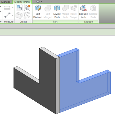

You can now specifically exclude Parts from a project. The exclude Part is not visible & will not be scheduled in Parts schedules or component lists. These excluded Parts can be restored at any time by pre-highlighting the Part & using the restore controls from the Ribbon.

The shape handle functionality has been expanded. If a Part is selected, you now get shape handle controls on all faces of the element; just select the reset shape from the Ribbon if you need to reset the Part back to its original form.

Assembly views have also undergone some changes. When creating an Assembly view, you will find additional views available, enabling you to create detail section assembly views from around the Assembly.

The restrictions in 2012 that related to Assembly views & sheets have been lifted. You can now place Assembly views on non-assembly sheets; also Assembly sheets are able to host non-assembly views. This opens up the opportunity for Parts & Assembly to play a significant role where you need to do IPD related construction information or where a designer might need to generate fabrication detailing during CD stage.
All Assemblies how have an origin which is visible in the Edit Assembly Mode. The origin displays as a “point” similar to that available within the conceptual massing tools. This origin points defines the default orientation of the assembly views & also is the centroid that is used if you decide to swap assembly types.
If you divide Parts by drawing sketch line or using intersecting reference planes, in the properties you now choose to add a divider gap value. This allows you to generate parametric gaps on the parts you have created. I can see this being really useful for creating quick & dirty concrete paneling on facades, where you don’t necessarily want to use face based families.

Finally, the feature I have had most fun with is the ability to add a custom profile to divided Parts. A new type of family profile called Division Profile has been introduced that is comprised of a single curve chain that works with the previously mentioned Divider gap parameter. This allows you to generate complex joint conditions; for instance the types you might typically get on pre-cast concrete panels. Previously I was hacking Curtain Panels to achieve this, but I like this new functionality much more.

Each profile can be configured using the properties dialog. The Edge Match parameter defines how to relate the profile relative to the gap distance. There are three possible options; complementary keeps the profiles parallel to one another, mirrored will mirror the division & rotated creates a mirrored & rotated condition.

Worksharing
Last year we saw a major overhaul to worksharing, certainly these improvements have helped with the “large team” workflows but there were a few features which didn’t make the shipping version, however they are now included in 2013. When an Edit Request Notification appears, if you move your cursor over the request, this highlights the corresponding elements. A nice touch is the ability to click in an Editing Request Notification as this now enables the Editing Request Dialog. The Editing Request Notifications now provide Grant & Deny buttons for granting or denying an editing request, so you no longer have to bring up the Edit Request dialog to act on a notification request. Additionally, deleted & new elements in the central file are now shown in the Editing Request Notification.General productivity improvements
A release of Revit wouldn’t be complete without general productivity improvements. These enhancements can make all the difference to day to day productivity, there are numerous, but I will pick up the ones which I feel are most compelling. If you have a multi-segment dimension & you decide that you want to remove a particular dimension in the string, you can now tab to the dimension & hit the delete key & the dimension is removed from the string.
It’s funny, but for a heavy weight package such as Revit, there was no diameter dimension tool! 2013 now includes that functionality.

If you equalize a dimension string, you can now to set up dimension parameter to display the dimension in a number of ways, so as well as having value & text you cans also Equality Formula String.

If you do a lot of panning & zooming, then you are genuinely going to appreciate the ability to double click the middle wheel mouse button to invoke a zoom to fit! Another really splendid feature is the ability to search the project browser! About “bloody time”, I have wasted endless hours scrolling up & down the PB on complex mega projects looking for a particular view which I know exist, but I can’t find. The search function works similar to the find function in Microsoft Word, you enter the text for the view you are looking for, and there is a next & previous button to allow you to search through the matches. Your match is highlighted in the PB & the PB will even scroll if required to display the match.

Divide & Conquer
I think most Revit users are now comfortable with the conceptual massing tools & the in-place mass functionality in Revit’s project environment. However, whilst it opens up opportunities to build complex forms & surfaces it still lacks certain functions. Have you ever noticed you cannot array in the massing environment? Revit 2013 breaks that limitation by including a divide path tool. This allows the users to divide a range of curves such as lines, arc, ellipses, partial ellipses, Bezier splines, Hermite splines as well as chain curves & edges of forms. All you need to do to divide a path, is select the curve, edge or form you want to divide, invoke the Divide Path tool from the Ribbon & the path is divided, placing a series of node points along the path. The path can be divided by Distance between divisions, Number of divisions, Max or Min distance or you can divide by intersects. Once a path is divided, a number is position by the path, which defines the number of divisions. This number can be clicked in canvas & edited so that you can alter the number of divisions. As you would expect you can assign the division number to a parameter to drive the number of divisions.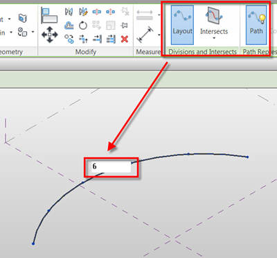
So dividing with a series points/nodes is all well & good, but can you place families or elements at each node location? Well the answer to that is to use an Adaptive Component. If you divide your line, then create a Simple Generic model Adaptive Component family. Next load the AC into the divided line family & you can then place the AC on a node of the divided line. There is a new Repeat button; this allows you repeat the AC on all the nodes along the divided path. It couldn’t be simpler.


There are various ways you can place the AC’s so you can miss or even mix up different AC’s types to create different configurations for AC’s on the nodes. As well as using single point AC’s, you can also use multi point AC’s on multiple hosted curves, edges & even divided surfaces.

Again, the principles is as before, but this time draw two lines & divide these. Create a 2 point AC, load this into the divided line family & place the AC onto the nodes in the two divided lines. Hit Repeat & voila! I have played extensively with this feature, looking at all sorts of weird & wonderful options, even ones which I thought it might fail on, but it works a treat. What is not yet possible is to have a scale parameter, so as the AC is repeated along a line it can reduce or increased in size by a known value.
Architectural big ticket items - visualization
So far if you have managed to wade your way through this review of new Revit 2013 functionality, hopeful you found some useful improvements which will assist when using Revit. However, what about some real barn storming functionality? Ok, let’s start with visualization graphics. Whilst visualization graphics may be low hanging fruit to some BIM purists, to architects & designers a like, it is visualization functionality & the way you present your scheme that helps sell it. I know plenty of people who seemed to enjoy the class that Jason Grant & I gave at AU2011 on presentation graphics, so presentation graphics must be important to some people. In 2013 the Ghost Surfaces & Transparent Override options have been replaced with a single Surface Transparency slider. The Transparency slider allows you to control surfaces between 0 & 100%, so you can control individual elements with different levels of transparency.

Anti-Aliasing can be applied to all views, not just 3d views. If you use RPC content, these will preview correctly in Realistic Visual Style Views. The Graphic Display Option dialog has been further enhanced. You can now choose to between a new Sky background style, Images as background as well as the now famed Gradients backgrounds. You can choose a custom ground colour for the new Sky background, but the Sky colour itself is fixed, also it should be noted that the Sky background can is a little heavy for real-time use but ideal for presentation graphics. Finally we can also use Sky, images, and gradients in elevations, sections, isometrics & perspectives, so no more having to import bitmaps into these views to create sky backgrounds!

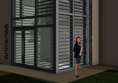
If you use Realistic Visual Styles in 3d isometric or perspectives views, you can now specify artificial lights & Photographic Exposure lighting schemes, exactly the same way you do in the mental ray renderer. Performance is slow, but for presentation graphics where you don’t want to render the image using mental ray, it’s a praiseworthy improvement.

A new progressive real-time ray trace render style has been introduced. You enable this new style from the view control bar. As soon as you enable it, the Revit caches the model; the view then starts to render immediately as a photorealistic style. You are able still able to pan & zoom around the Revit model, allowing you to create interactive walk through, but be aware that this renderer is using the processor & not the GPU of the graphics card, so the better your processor, the quicker the viewport will render. The rendering quality starts at low quality, but the longer you leave it the better the quality of the image. You are able to set the lighting, exposure & background from the graphic options dialogue. Once you have reach the quality image you require, you can stop the rendering by either clicking in the view or stopping render from the interactive Ray trace panel. You are able to save views that have been rendered, but be aware that these are only at screen resolution. I am confused why Autodesk thought we needed Ray trace viewport rendering when we have Mental Ray & cloud rendering. Seems rather over kill to me; I would have preferred the effort to have been focused on giving us sketchy graphic styles similar to that product that sounds like a well-known red source product.


Architectural big ticket items – stairs & railings
Revit Stairs & Railings…..where do you start! On the whole they are great, but those that are new to Revit soon realize there are some obvious shortcomings when using Stairs & Railings. Not that they are a complete failure, the sketch based process works well & is more aligned with how you typically draft a stair, but granular control is not easy & the way stairs displayed on screen does not always match with local graphic conventions. However, if you have ever read or watched Phil Reads AU class on stairs & railings you realize once mastered, you could hack your way through to create even the most complex stair design using the standard tools available. But for the rest of us, we just want a stair component which just works as we expect to see it. Therefore, to help the “modelling” challenged, Revit 2013 introduces a new stair tool which is component-based rather than sketch based.
The new stairs allows you to assemble a stair using run, landing & support components. Each of these components can be individually modified using grab handles, so the changes can be made in canvas. The improved tools allow you to configure component based stairs in multiply configurations.
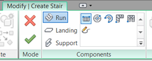 The
process seems very reminiscent of how you develop stairs in AutoCAD
Architecture, the move away from a sketch based approached is certainly
alien to me. But the more you play with the functionality the more you
recognize that this is genuine move in the right direction. For instance
I am most pleased to see that I can now create a 3 run stair or switch
back stair. In the past you had to either wrap the sketch on itself,
which causes genuine downstream editing issues or you had to create two
separate stairs. As the stair is a proper 3d component, this opens up
far more flexibility in its configuration, so the new stairs also allow
you to customize the end to suit different concrete stair conditions.
The other challenge with stairs has been how they graphically appear as well as how you dimension & annotate them. I have lost count how many hours I have wasted arguing / discussing with architects & project managers why Revit displays stairs how they do. But it’s difficult to defend the in defensible. So these new stairs are far more customizable from a graphics perspective, although the number of sub-categories used to define a stair is confusing. I know that Autodesk has done a lot of user research in this area, as I have provided feedback on the way we like to see stair cases displayed here in the UK. Annotation improvements mean we can annotate individual stair run, landing, and support components. We can now tag the tread depth; treads & risers can be numbered using a Stair Tread / Riser Number tag & we can now properly dimension stairs.

As stairs have moved to component based approach Revit 2013, so are railings. This is not yet complete, there is still much work to do, but the direction is promising. In Revit 2013 there are new handrail and top rail sub-category elements, improved railing transitions, and the ability to include system generated extensions to top rails and handrails. Getting access to the hand rail is very confusing; you need to tab select to get access to the handrail before you edit it. It certainly isn’t very discoverable.

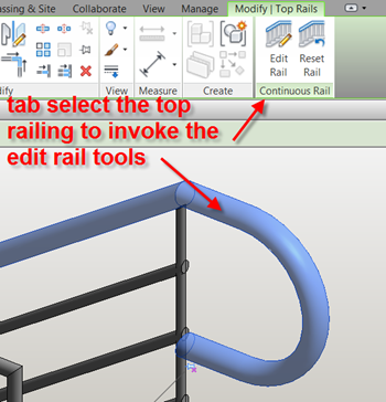 The
stair & railing is an on-going multi-year project, so what you see
in Revit 2013 is the first incarnation. So if you still yearn for the
sketch based stair tools, they are still included. Also, you can convert
a component based stair to a sketch based stair for more finite
editing, but be aware once you do this; you are not able to convert the
sketch back to a component. This is annoying, but as long as you are
aware its fine.
 Conclusion
So there you are, the major improvements for Revit 2013. Am I happy? I think so, but sometimes my expectations are greater than what is delivered. Nether the less Revit 2013 does deliver genuine user productivity benefits. Slowly but surely each release of Revit sees improvements in primary functionality.If I am truthful, there are aspects of Revit development which have managed to keep up with the pace of industry BIM developments. The Assembly & Parts tools are a case in point, but there are others tools for whatever reason are lagging behind & are starting to show their age. My hope is Autodesk recognise this & address these short comings. The lack of development in the site tools is unbelievably irritating.
One other major concern I have is that often functionality is released which on the face of it seems only partially complete. The staircase improvements are a good example of this. Whilst the new stair tool addresses some specific requirements, which is pleasing to see, in others areas it falls short. Why is this a concern? It relates to training. You now have to train two methods for creating a stair. This can be confusing to the new user & equally frustrating to the Revit expert. The number of hidden dialogue boxed & parameter settings you need to fight your way to customise a stair is truly amazing. It’s certainly not discoverable & goes against everything I believe Revit should be. It may not be a big deal for some, but as I have said many times, moving people to a BIM centric workflow is about changing hearts & minds. I don’t see why the experts have to continually justify why some tools are not finished or why there are two different ways to create the same element. I understand things take time to develop & there are only so many man hours during a yearly development cycle, but a maybe a modular approach could be the answer to ensure things get to a better completed state? It’s a careful balancing act between providing value to the existing client base and ensuring continued dominance and further growth of the Revit platform.
BIM is no longer a pipe dream or something for the earlier adopters or technologists; therefore we need a suite of tools that can deliver at all levels. I do feel that after 10 years, Revit 2013 is going back to its original roots as a solution for the AEC industry.
Thursday, September 13, 2012
2013 Stair Handrail Issue - from Revit Geek's Blog
Good find over at the Revit Geek's Blog
In Revit 2013 one of the small changes to stairs was the “End With Riser” (as well as “Begin With Riser”) value was changed to an instance based value. When creating precast stairs this value is unchecked by default. The issue is not with the stair itself rather with the handrail that is created.
When this value is unchecked the handrail does not remain parallel with the run of the stair.

Once the “End with Riser” value is checked the rail becomes parallel again.

So how do we resolve this issue if we need the run to not end with a riser. Edit the path of the rail and make the lines align with the top tread of the stair, then select the sketch line at the landing and make the value for it to be flat.

In Revit 2013 one of the small changes to stairs was the “End With Riser” (as well as “Begin With Riser”) value was changed to an instance based value. When creating precast stairs this value is unchecked by default. The issue is not with the stair itself rather with the handrail that is created.
When this value is unchecked the handrail does not remain parallel with the run of the stair.
Once the “End with Riser” value is checked the rail becomes parallel again.
So how do we resolve this issue if we need the run to not end with a riser. Edit the path of the rail and make the lines align with the top tread of the stair, then select the sketch line at the landing and make the value for it to be flat.
Thursday, August 23, 2012
From The Revit Alliance: New Instance Properties for Levels in 2013 !?!
Interesting find from:The Revit Alliance: New Instance Properties for Levels in 2013 !?!
They stumbled across these two check boxes in the level properties today and had never noticed them before...

So I hopped over to 2012 and they weren't there.. which made me go to wikihelp for more info...
Which only got me more curious...
Shouldn't Structural be checked on by default in Revit Structure? I mean, 90% of my levels are primarily structural.
Checking one or the other doesn't affect the look of the level any.. seems like it may be better if these were type parameters instead and you could change the symbol or something.
I like the building story and really hope that RAM works this in with their RAM/REVIT link because that would be super useful for not exporting the levels we don't want as stories in RAM.. especially the foundation 'story' .. I haven't gotten a chance to look into the new RAM link yet.. so.. does anyone know if this helps??
Besides the linking with analytical softwares thing, what else is logical day-to-day uses for this?
Very Interesting The Revit Alliance!
They stumbled across these two check boxes in the level properties today and had never noticed them before...

So I hopped over to 2012 and they weren't there.. which made me go to wikihelp for more info...
Which only got me more curious...
Shouldn't Structural be checked on by default in Revit Structure? I mean, 90% of my levels are primarily structural.
Checking one or the other doesn't affect the look of the level any.. seems like it may be better if these were type parameters instead and you could change the symbol or something.
I like the building story and really hope that RAM works this in with their RAM/REVIT link because that would be super useful for not exporting the levels we don't want as stories in RAM.. especially the foundation 'story' .. I haven't gotten a chance to look into the new RAM link yet.. so.. does anyone know if this helps??
Besides the linking with analytical softwares thing, what else is logical day-to-day uses for this?
Very Interesting The Revit Alliance!
Subscribe to:
Comments (Atom)

